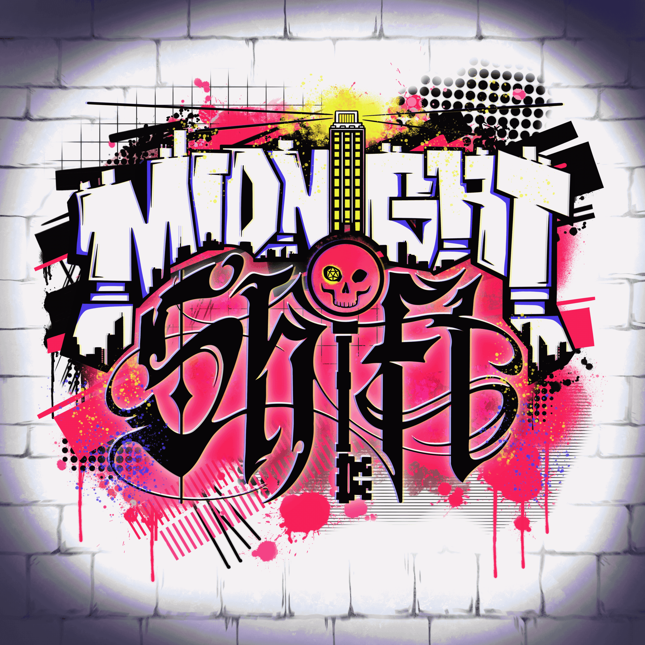
Midnight Shift Logo
This design was created for a Dungeons and Dragons campaign that had a modern sort of twist to it. The description of the setting mentioned a skyscraper in the middle of a New York-like city.
The client referenced artwork similar to the ‘trash polka’ style of tattoo which involves a lot of different elements and styles that blend together. There’s halftones and spray paint elements that are balanced by the more solid squares and lines.
The result ended up being a balance of bold graffi style typography and creepy swooping fantasy typography.


Step 1:
I started with a set of six sketches to try and narrow down a good design. Trying to balance the modern with the fantastical was an interesting exercise and I understood that this logo would set the tone for the campaign.
Step 2:
After the initial set of sketches, the client said that they liked the designs of A and the design of C of the first run. They also specifically mentioned they liked F but wanted to see the fonts flipped, which can be seen in B in this design.
Step 3:
Finally, we had a discussion on the colors of the piece and how they would fit with the overall design. The client wanted bold and bright colors to stand out and we ended up on the bright pink with neon yellow and neon blue highlights.
